The Process of the Planet of the Apes

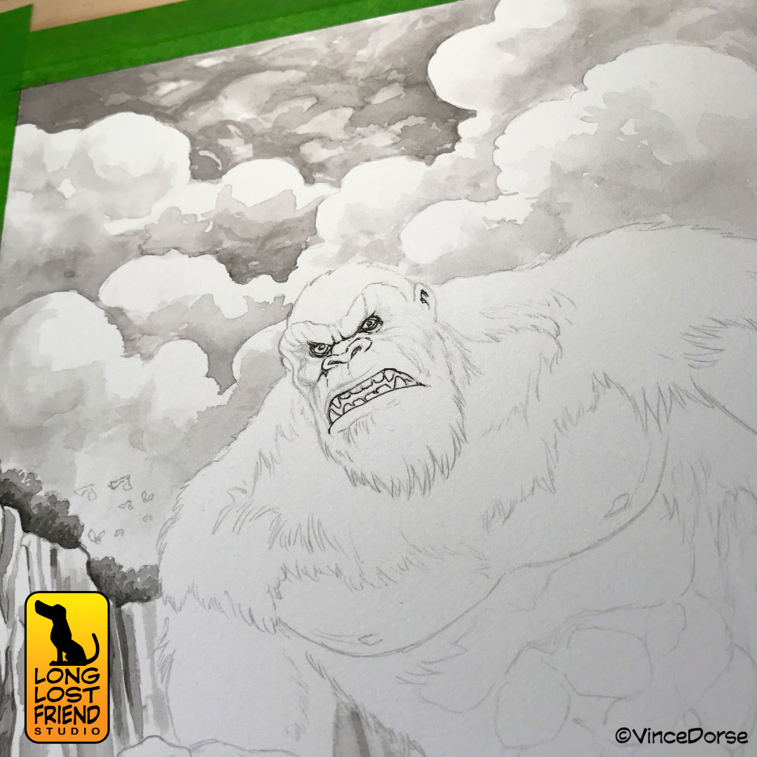
Like many sci-fi fans, Michelle and I are hyped to see Kingdom of the Planet of the Apes. A nice, long, wordy title but it still doesn’t beat The Incredibly Strange Creatures Who Stopped Living and Became Mixed-Up Zombies. Nevertheless, I think the ape movie might be the better film. So we’re gearing up for it by doing some ape art.

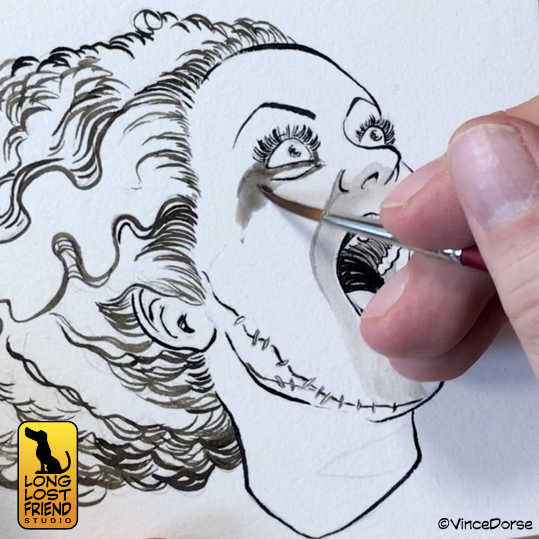
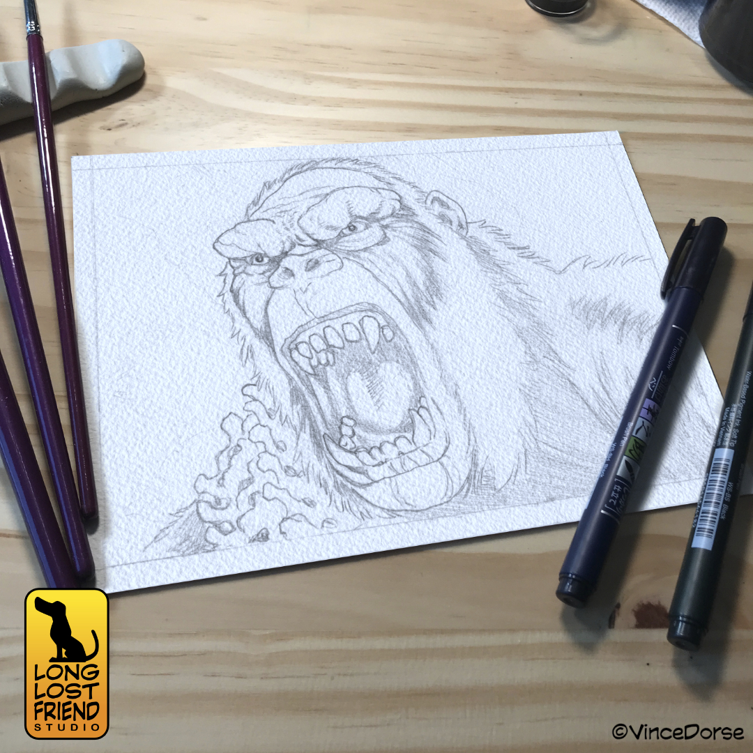
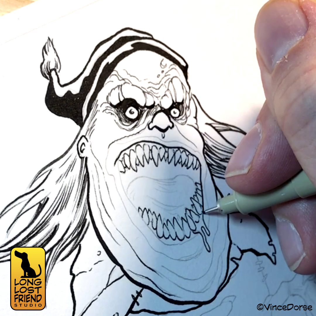
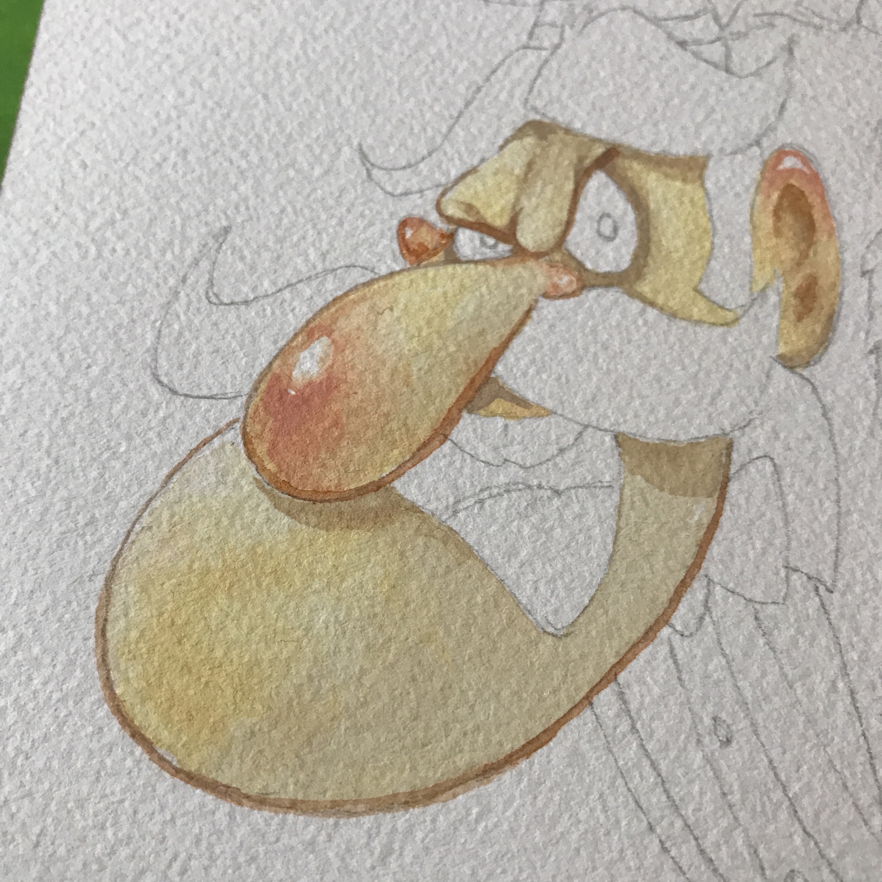
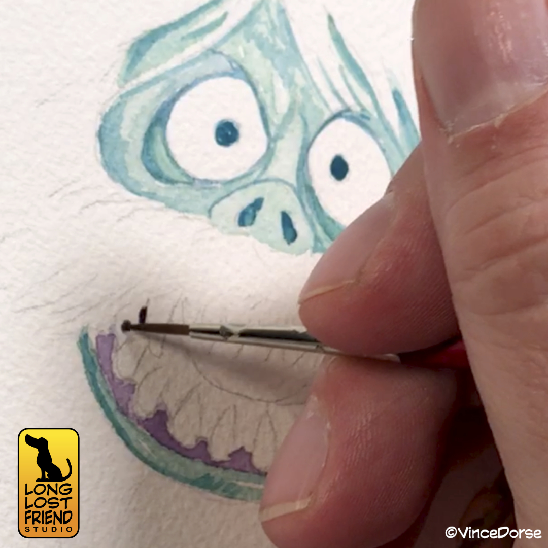
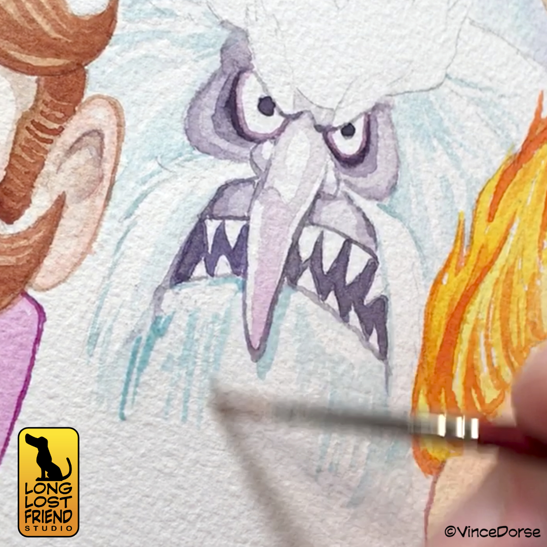
In this week’s video, I do an ink and watercolor illustration of the movie’s antagonist, Proximus Caesar. He’s a big, scary ape and he fits right in with our channel’s usual monsters-and-villains theme. And in keeping with our share-the-knowledge theme, we recorded my process.

In the video, I take you through my entire illustration process from digital sketch to pencils to inks and finished watercolor. My way is certainly not the only way to do it, or even the best way. But in searching for the best way to do things, Michelle and I enjoy watching process videos by different artists and learning all the options. If you like that stuff too, maybe you’ll enjoy this video.

Have you seen the trailers for Kingdom of the Planet of the Apes? I’m always on YouTube so it’s kinda’ hard to avoid them, and any accompanying spoilers from the peanut gallery. For the past six months everyone and their brother has been speculating on the plot, the characters, whether or not there’s time travel, whether or not it’s a reboot of the original 1968 film — enough already. It opens this Friday and I’m gonna plug my ears until I see it.

If you’d like to see our completely spoiler free video where I draw Proximus Caesar, the link is below.

She’s Alive!

This week marks the 89th anniversary of the classic Universal Monster movie, The Bride of Frankenstein. Michelle and I realized this late into the evening on Saturday and quickly ripped through a new ink wash illustration and process video to celebrate the occasion.

The actual bride of Frankenstein (played by Elsa Lanchester in a dual role that also saw her portray Mary Shelley) only appeared in that one eponymous movie. But despite not having as many times up at bat as Frankenstein’s Monster, Dracula, or The Wolfman, the character has left just as indelible an impression on pop culture as her monstrous counterparts.

And while I always look forward to rendering The Bride in watercolors and debunking the idea that she has green skin (preposterous!), I wanted to stick to the same black-and-sepia ink and wash technique I used on all those other Universal Monsters last October. Now she fits right in with the rest of them.

The sepia ink is a nice counterpoint to the black ink, but I wanted to use it for The Bride for a very specific reason. Elsa Lanchester had red hair. You can see it very clearly years later when she plays Katie Nanna in Mary Poppins opposite Julie Andrews. It follows, then, that The Bride of Frankenstein may also have had red hair. It’s not canon? Well…it’s my drawing, and I say she did. The warmer tones of the sepia ink do a passable job of conveying the idea that she has red hair, while not being as obvious as a watercolor wash.

If you want to see my process for this image, how it turned out, and listen to Michelle and I gab about movies and toys for seven minutes or so, the link to the video is below.

Studying the Way of the Samurai

Preparing to work on an upcoming Usagi Yojimbo commission, Michelle and I realized we knew little to nothing about the character. So, this past week we’ve been researching the Stan Sakai comic, doing some sketches, and, in this week’s video, a full ink, wash, and watercolor study of the samurai rabbit.

Wikipedia tells me Usagi Yojimbo is heavily influenced by Japanese cinema, Kurosawa, and other samurai pop culture icons. And it’s here that I realize there is a giant hole in my pop culture/cinema foundation. Aside from flipping through some issues of Lone Wolf and Cub back in college, I never really dove into stories involving samurai and ronins and swordplay. I read a few issues of Groo the Wanderer, which Sakai lettered, but it was mostly for the comedy and the classic Sergio Aragones cartooning. Look, I like comedy and monsters. Who knew there was such rich storytelling going on involving feudal japan and anthropomorphic rabbits? Everyone but me, apparently.

The watercolor study this week doesn’t do much to shore up my knowledge of that culture, but it does help me put a shape to the character. I think what little research we’ve done informed my decisions on how to pose the character, and to try to convey a quiet strength in his stance and expression.

And though the character and storyline of Usagi Yojimbo are set centuries ago in feudal Japan, this study prompted me to use modern technology to develop a new tool to help in the inking and coloring process.

Worried I’d lay down a wobbly or broken line when inking the katana and sheath, and having no flexible ruler to mold to my drawing’s sketch lines, I used a scan of my sketch, vector software, and a laser cutter to create a custom ruler out of wood.

Was it an over the top move for a simple study? Probably. Should I have just used the opportunity to strengthen my freehand inking skills? Definitely. But like the ronin’s of feudal Japan, I have no master. And I have cut ties with my family and clan. So if I want to buck the traditional methods of inking an anthropomorphic rabbit to turn out a half decent illustration, who’s to say I can’t? No one. You’re not the boss of me.

We recorded my process for creating this Usagi Yojimbo illustration. If you want to see how the illustration turned out, or watch me wield my deadly samurai custom ruler, the link to this week’s video is down

*blog originally posted at vincedorse.com

If You’ve Had A Dose of a Freaky Ghost

Who you gonna call? Not Michelle or I, that’s for sure. We don’t want anything to do with ghosts. Unless, of course, the ghosts are part of some cute and creepy art project like this week’s Ghostbusters Mini-Puft Sculpt-Off!

To hype ourselves up for the opening of Ghostbusters:Frozen Empire, we challenged each other to sculpt one of the tiny marshmallow mini-pufts from the movie. Michelle chose to work with felted wool, and I decided to sculpt my spook out of clay.

There are pros and cons to each medium. Michelle benefited from being able to alter, change, and repair her sculpt right up to and through our video/photo shoot. I couldn’t do that with my solid rock of clay.

On the other hand, my clay sculpt didn’t confuse the camera the way the fuzzy wool edges of Michelle’s sculpt did, and I was able to finish my sculpt well before she could. The needle felting process consumes time the way Slimer consumes hot dogs.

The bases we decided on are just simple black plinths with the classic Ghostbusters “NO” logo on top. That way they retain that black/white/red color theme of the original logo, and the mini-puft ghosts look like they’re popping out of the logo to come to life.

One final element we added to match the violent streak these malevolent marshmallows posses is weaponry. In the movie, these creatures are always putting each other through devastating physical distress: burning each other with fire, running each other through with skewers, liquifying each other in blenders. But our creatures aren’t marshmallows, they’re clay and wool. So their weapons reflect their art supply origins.

If you wanna see Michelle and I try to defeat each other in this Ghostbusters Sculpt-Off, the video is linked below.

You Know The Name of King Kong

Back in January, we inked Godzilla as a way to celebrate our love of Godzilla Minus One. This month, Godzilla X Kong:The New Empire hits theatres. And while we’re not sure whether we’ll love it or not, Michelle and I thought it was only fair to ink up a King Kong in anticipation of the release.

The difference between the two should be obvious. I inked Godzilla with pens, using hatching to achieve my grey tones. With Kong, I decided to use ink wash. It’s a softer look, but I think it works well for the composition and subject (a giant gorilla stomping through a misty forest on an uncharted island).

In addition to my own ape inks, we have once again conned Michelle into playing a game of “Ink It or Stink It” where she’ll take a run at inking my drawing of Kong’s apparent nemesis, Skar King.

We both learned a little about technique and materials while working on these, which is our constant goal. But if you want to see how they turned out, you can check out the video at the link below:

Taking A Run At Scooby-Doo’s Ghost Clown

The comedy-themed project streak continues unabated this week as Michelle and I each take a turn at rendering the classic Scooby-Doo villain, Ghost Clown. And everyone knows there’s nothing funnier than a clown who could swallow you whole.

The clown first appeared in episode 10 of the first season, Bedlam In The Bigtop. I’m guessing the original clown design was done by Iwao Takamodo, since he handled most of the designs for those early Scooby-Doo episode. His design was tight and perfect for the show, and looked like this:

I love that clown. But I wanted to try to make him a little scarier. So, after a few sketches, I landed on a slug-like monster with two-rows of razor sharp teeth. I lightboxed my digital sketch, and inked it with Microns, Tombow Brush Pens, and some brushed inks.

The wash I use is just water and Dr.Ph Martin’s Black Star ink. I keep a few pre-mixed jars of it so I don’t have to work out the ink-to-water proportions every time I sit down to do a wash. Once all of that ink is dry — all of it waterproof — I put down some nice, bright, circus colors that echo the original Scooby-Doo design.

And in addition to my version of the clown, this week Michelle plays another round of Ink It or Stink It where she tries to ink one of my drawings for a panel of judges. I sketched out the original Takamodo design for her to try her hand at, and members of our Patreon voted whether the final outcome was an “ink” or a “stink.”

If you want to see the process video, and hear us talk about Bedlam In the Bigtop, the video link is below.

Our Holiday Tribute to Rankin/Bass

If you’re old enough to have watched all those great Rankin/Bass stop motion holiday specials when you were a kid — or young enough that your parents force you to watch them because “that’s what Christmas was like when I was your age!” — then you might enjoy our holiday card for this year. It’s an illustration of some of the worst creeps and goons Rankin/Bass ever animated.

Creeps like Professor Hinkle, for example. The failed magician who ended up stalking a small child through a frozen wasteland only to lock her in a greenhouse while her magical snowman friend melted into lukewarm water. Nice guy, right? And a wonderful thing for children to watch. It really helped prepare us for the real world. Never trust a magician.

And, of course, you have the Miser Brothers, Snow and Heat. These two petulant monsters argued constantly to get their way and threw tantrums when they didn’t. A great example of now NOT to solve conflicts. These Rankin/Bass specials really were valuable on so many levels.

And that’s why we decided to honor those fantastic holiday specials with a collage of their villains. We did it in watercolor — no colored pencils or inks for linework or details — and tried to capture that holiday magic that Rankin/Bass imbued all of their stop motion specials with. Well…maybe not Little Drummer Boy. That one always put me to sleep.

If you’d like to see us put this holiday illustration together, you can watch the video below. And since it’s just a couple weeks until the end of the year — Happy Holidays! We hope you have a wonderful holiday and best wishes for 2024!

Trying Gouache For The First Time

I recently received a book filled with Mary Blair’s concept art for Disney and spent an hour flipping through all the amazing illustrations. It was a crash course in how to effectively use color and composition to tell a story.

The image above is from her concept artwork for The Adventures of Ichabod and Mr. Toad, a classic Disney feature and an annual watch around here near Halloween.

The book is filled with images like this, and, since Blair worked mostly in gouache and watercolor to create these images, it inspired me to try gouache for the first time. There’s a bit of a learning curve since this medium sits somewhere between acrylics and watercolors…and I consider myself a novice at both.

But, since experimenting is what we do around here, I pressed on. I started with a basic gradient blend, something Blair relied on heavily in her concept art. And while you can use gouache much like watercolor — diluting it and layering translucent washes — I tried to use it the way Mary Blair did in her illustrations: just enough water to create a loose but creamy texture that glides over the paper and remains satisfyingly opaque.

I ended up doing four separate paintings. Practice makes progress. Because Blair and her work for Disney was my inspiration, I stuck mostly to Disney ghosts. Doing a couple from the Haunted Mansion, and even my own take on the Headless Horseman.

For my first attempt with gouache, I was pretty happy with my results. But a lot of that was due to the gouache and how, even when the paint dried to a dead flat finish, the colors stayed vibrant and alive. I can’t wait to try it again and see what else I come up with.

The Haunted Mansion movie opens this weekend, so I may get out of the heat and into an air conditioned recliner to see if inspiration strikes again. And if you’d like to see my first-time gouache experiment, there’s a link to this week’s video below.

Friendly Neighborhood Spider Sketches

No elaborate diorama building this week, just some basic ink and watercolor practice. For inspiration, we used a couple of Spider-Man characters that have been trending lately. First, because Across The SpiderVerse was king of the box office, we decided to do a quick ink and watercolor sketch of Miles Morales.

There was also a lot of buzz about Aaron Taylor Johnson and the upcoming Kraven The Hunter movie. So far, I’m not sure how I feel about a young, model-handsome Kraven, so I went with the old school, fed-face-angry, teeth-clenching Kraven from the comics. That guy was unhinged.

I like to try to stay in practice with the illustration tools I want to become proficient with, so for these sketches I used a couple different brush pens, as well as the old school brush and ink. With the watercolors, I challenged myself to mix the flesh tones with just the primary colors.

So, all in all, a good week of practice. I’m thinking about doing it more often. I go over the pros and cons of the tools I use, as well as my techniques, in this week’s video. I linked it below in case you want to see how it all turned out.

Colored Pencil Practice with Hector from Coco

Couple of weeks ago, Michelle and I were racing to meet a deadline for a gallery piece but still needed to upload some sort of video to YouTube. That usually means I need to crank out some quick, 2D art and, hopefully, learn and grow a little during the creative process. Enter, Hector Rivera from Pixar’s Coco.

Hector is one of my favorite characters and, like I said, I needed to practice my colored pencil rendering. So I sketched Hector in pencil, and started layering in colors with my Prismacolor Premier colored pencils.

One of the things I wanted to work on is my blending. You can do it a few different ways. Layering color over color over color, of course. But once you have those color layers, maybe you’d like to smooth them out a bit. That’s where mineral spirits come in. You can brush those on and they act as a solvent, blending the colors even smoother.

You can also blend with a light-colored pencil, burnishing all the layers beneath into a smoother texture. I’m no expert. So I still have to work on this stuff. But that’s the benefit of cranking out a character sketch for a YouTube video. I get to practice and I end up with a fun piece of art.

Sharpened up the pencils for the final details — the decorations on Hector’s skull — and I’m about done. If you’d like to see me work on this from start to finish, the link to our video is down below.