She’s Alive!

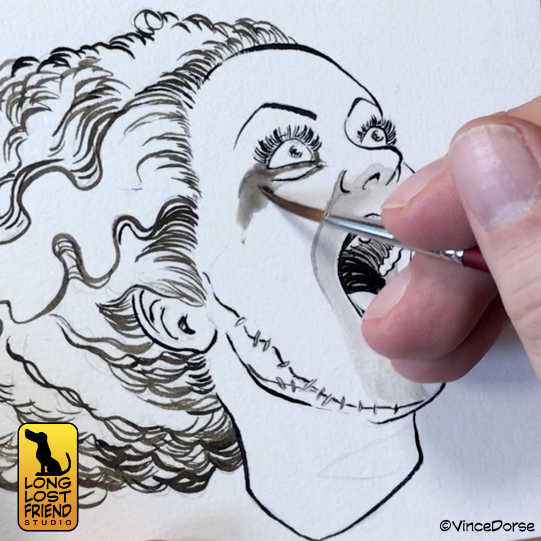
This week marks the 89th anniversary of the classic Universal Monster movie, The Bride of Frankenstein. Michelle and I realized this late into the evening on Saturday and quickly ripped through a new ink wash illustration and process video to celebrate the occasion.

The actual bride of Frankenstein (played by Elsa Lanchester in a dual role that also saw her portray Mary Shelley) only appeared in that one eponymous movie. But despite not having as many times up at bat as Frankenstein’s Monster, Dracula, or The Wolfman, the character has left just as indelible an impression on pop culture as her monstrous counterparts.

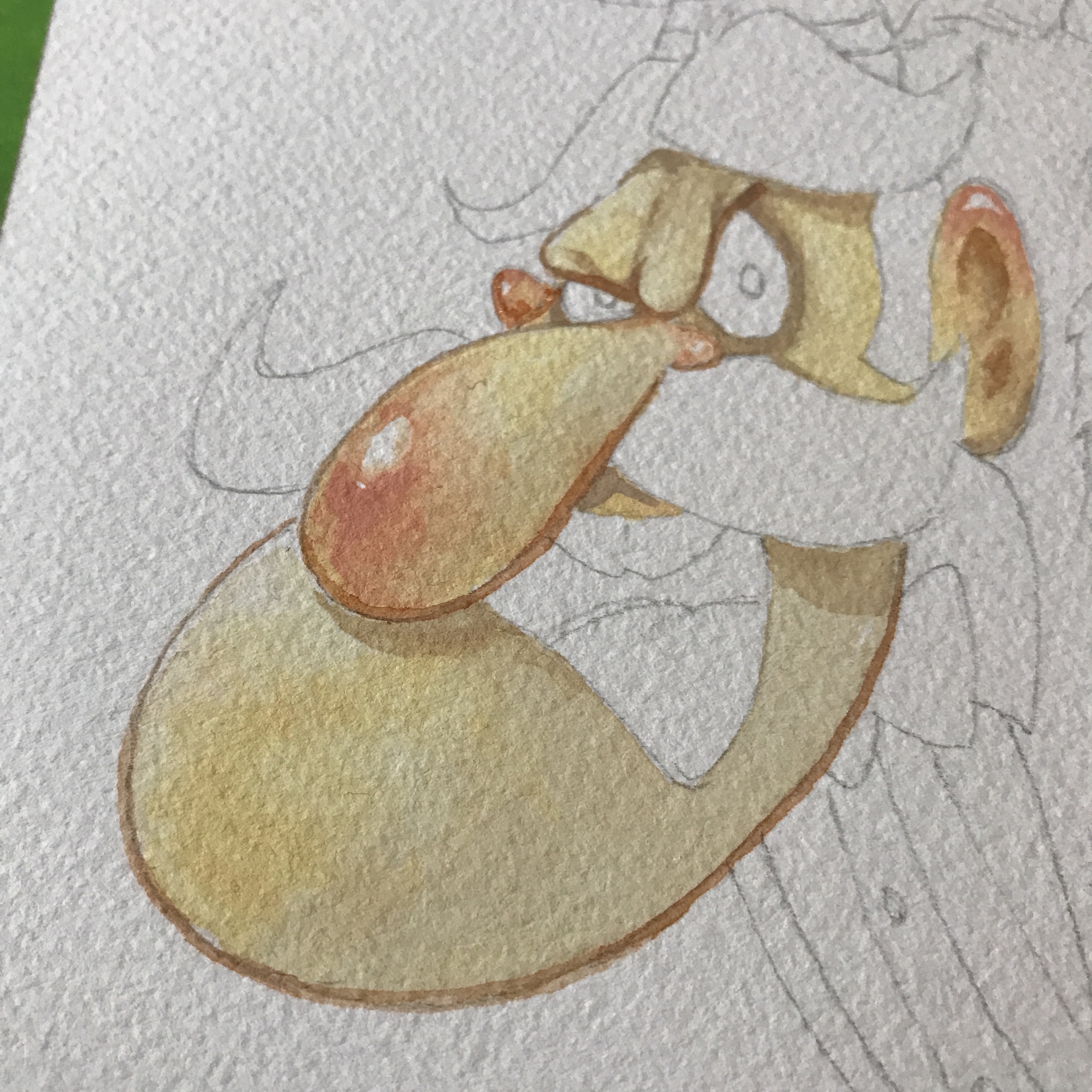
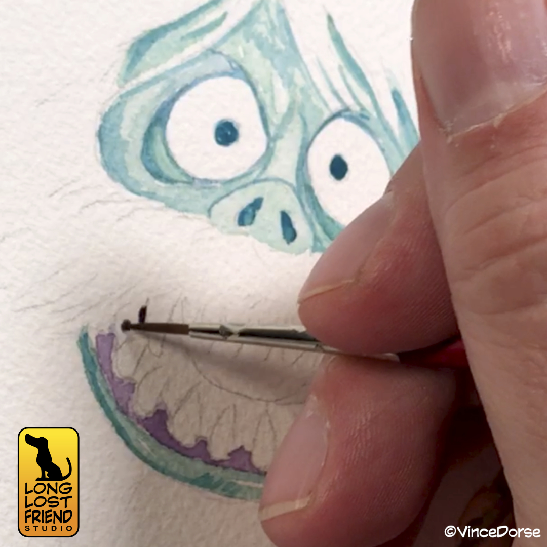
And while I always look forward to rendering The Bride in watercolors and debunking the idea that she has green skin (preposterous!), I wanted to stick to the same black-and-sepia ink and wash technique I used on all those other Universal Monsters last October. Now she fits right in with the rest of them.

The sepia ink is a nice counterpoint to the black ink, but I wanted to use it for The Bride for a very specific reason. Elsa Lanchester had red hair. You can see it very clearly years later when she plays Katie Nanna in Mary Poppins opposite Julie Andrews. It follows, then, that The Bride of Frankenstein may also have had red hair. It’s not canon? Well…it’s my drawing, and I say she did. The warmer tones of the sepia ink do a passable job of conveying the idea that she has red hair, while not being as obvious as a watercolor wash.

If you want to see my process for this image, how it turned out, and listen to Michelle and I gab about movies and toys for seven minutes or so, the link to the video is below.

If You’ve Had A Dose of a Freaky Ghost

Who you gonna call? Not Michelle or I, that’s for sure. We don’t want anything to do with ghosts. Unless, of course, the ghosts are part of some cute and creepy art project like this week’s Ghostbusters Mini-Puft Sculpt-Off!

To hype ourselves up for the opening of Ghostbusters:Frozen Empire, we challenged each other to sculpt one of the tiny marshmallow mini-pufts from the movie. Michelle chose to work with felted wool, and I decided to sculpt my spook out of clay.

There are pros and cons to each medium. Michelle benefited from being able to alter, change, and repair her sculpt right up to and through our video/photo shoot. I couldn’t do that with my solid rock of clay.

On the other hand, my clay sculpt didn’t confuse the camera the way the fuzzy wool edges of Michelle’s sculpt did, and I was able to finish my sculpt well before she could. The needle felting process consumes time the way Slimer consumes hot dogs.

The bases we decided on are just simple black plinths with the classic Ghostbusters “NO” logo on top. That way they retain that black/white/red color theme of the original logo, and the mini-puft ghosts look like they’re popping out of the logo to come to life.

One final element we added to match the violent streak these malevolent marshmallows posses is weaponry. In the movie, these creatures are always putting each other through devastating physical distress: burning each other with fire, running each other through with skewers, liquifying each other in blenders. But our creatures aren’t marshmallows, they’re clay and wool. So their weapons reflect their art supply origins.

If you wanna see Michelle and I try to defeat each other in this Ghostbusters Sculpt-Off, the video is linked below.

You Know The Name of King Kong

Back in January, we inked Godzilla as a way to celebrate our love of Godzilla Minus One. This month, Godzilla X Kong:The New Empire hits theatres. And while we’re not sure whether we’ll love it or not, Michelle and I thought it was only fair to ink up a King Kong in anticipation of the release.

The difference between the two should be obvious. I inked Godzilla with pens, using hatching to achieve my grey tones. With Kong, I decided to use ink wash. It’s a softer look, but I think it works well for the composition and subject (a giant gorilla stomping through a misty forest on an uncharted island).

In addition to my own ape inks, we have once again conned Michelle into playing a game of “Ink It or Stink It” where she’ll take a run at inking my drawing of Kong’s apparent nemesis, Skar King.

We both learned a little about technique and materials while working on these, which is our constant goal. But if you want to see how they turned out, you can check out the video at the link below:

Taking A Run At Scooby-Doo’s Ghost Clown

The comedy-themed project streak continues unabated this week as Michelle and I each take a turn at rendering the classic Scooby-Doo villain, Ghost Clown. And everyone knows there’s nothing funnier than a clown who could swallow you whole.

The clown first appeared in episode 10 of the first season, Bedlam In The Bigtop. I’m guessing the original clown design was done by Iwao Takamodo, since he handled most of the designs for those early Scooby-Doo episode. His design was tight and perfect for the show, and looked like this:

I love that clown. But I wanted to try to make him a little scarier. So, after a few sketches, I landed on a slug-like monster with two-rows of razor sharp teeth. I lightboxed my digital sketch, and inked it with Microns, Tombow Brush Pens, and some brushed inks.

The wash I use is just water and Dr.Ph Martin’s Black Star ink. I keep a few pre-mixed jars of it so I don’t have to work out the ink-to-water proportions every time I sit down to do a wash. Once all of that ink is dry — all of it waterproof — I put down some nice, bright, circus colors that echo the original Scooby-Doo design.

And in addition to my version of the clown, this week Michelle plays another round of Ink It or Stink It where she tries to ink one of my drawings for a panel of judges. I sketched out the original Takamodo design for her to try her hand at, and members of our Patreon voted whether the final outcome was an “ink” or a “stink.”

If you want to see the process video, and hear us talk about Bedlam In the Bigtop, the video link is below.

Inking Godzilla Minus One

I don’t know what you guys did over holiday break, but Michelle and I just kept going back to the theatre to see Godzilla Minus One. We weren’t even necessarily huge Godzilla fans before this movie. I mean, of course he’s a ton of fun. He’s a monster. But this movie? It stomped us flat and left us breathless. Best movie we’ve seen in a long time.

When I was a kid, when I saw a monster movie that got under my skin, I’d spend days lying on the living room rug filling my sketch pad (and any other random piece of paper I could lay my hands on) with drawings of the monster. So it seemed natural for me to do the same thing with this new, powerful, terrifying Godzilla.

Big difference is that now I have better tools at my disposal. So I lightboxed my sketch onto heavy cotton watercolor paper, and went at it with Black Star inks and Micron fineliners.

My plan was to set up three distinct values — lights, mids, darks — and set up the composition so that they frame each other nicely, and lead the viewer’s eye where I want it to go. I wrestled over whether to render this in inkwash or hatching — each have their benefits — but chose to go with a very measured, hatched linework for the midtones to contrast with the chaos of the subject matter.

I had a lot of fun working on this and practicing my brushwork, hatching, and monster doodling. If you want to see me put the whole things together, Michelle and I recorded my process for this week’s video and talked about our Godzilla Minus One experience (no spoilers).

Our Holiday Tribute to Rankin/Bass

If you’re old enough to have watched all those great Rankin/Bass stop motion holiday specials when you were a kid — or young enough that your parents force you to watch them because “that’s what Christmas was like when I was your age!” — then you might enjoy our holiday card for this year. It’s an illustration of some of the worst creeps and goons Rankin/Bass ever animated.

Creeps like Professor Hinkle, for example. The failed magician who ended up stalking a small child through a frozen wasteland only to lock her in a greenhouse while her magical snowman friend melted into lukewarm water. Nice guy, right? And a wonderful thing for children to watch. It really helped prepare us for the real world. Never trust a magician.

And, of course, you have the Miser Brothers, Snow and Heat. These two petulant monsters argued constantly to get their way and threw tantrums when they didn’t. A great example of now NOT to solve conflicts. These Rankin/Bass specials really were valuable on so many levels.

And that’s why we decided to honor those fantastic holiday specials with a collage of their villains. We did it in watercolor — no colored pencils or inks for linework or details — and tried to capture that holiday magic that Rankin/Bass imbued all of their stop motion specials with. Well…maybe not Little Drummer Boy. That one always put me to sleep.

If you’d like to see us put this holiday illustration together, you can watch the video below. And since it’s just a couple weeks until the end of the year — Happy Holidays! We hope you have a wonderful holiday and best wishes for 2024!

My Friend’s Mailbox is Haunted!

Maybe haunted isn’t the right word. More like it’s crawling with monsters. And it’s not just one friend, it’s a few. And it’s all my fault. Because this year, Michelle and I decided to draw and ink a bunch of Universal Monsters and send them to some of our friends and Patreon supporters as Halloween cards.

Sending and receiving Halloween cards is a tradition that seemed a lot more prevalent when I was a kid. Hardly any of my friends do it anymore. But it’s something I always enjoyed, and something I’m not willing to let slip so easily into the past.

And while picking a few cards up in the drug store to mail out is perfectly fine, whenever I can squeeze in the time to make the cards by hand, it’s always a lot more fun. So I grabbed some watercolor paper, inks, brushes, and pens and got to work.

We even figured out a way to make them a little more than just hand-done illustrations (although, that would’ve been fine). We crafted a delivery system that made the drawings more like actual cards, and even supplied a little mystery by way of a window cutout that obscures parts of the illustration until you open the card.

If you want to see all the monsters we sent out to terrorize our friends this Halloween, you can watch the process video below:

Nothing But The Dead And Dying Back In Halloweentown

You can ignore the Simon & Garfunkle reference in the title. Sometimes I reach. But considering the number of zombies, mummies, and Frankenstein-types in the Disney Channel Original Movie, Halloweentown, it’s not too far off.

The diorama Michelle and I worked on this week, however, features a character from the movie that is definitely alive. In fact, they’re thriving like a pumpkin in early October. Because it is a pumpkin. A pumpkin person who appears in the movie for no more than three seconds, but quality, as you know, is more important than quantity.

I sculpted the little pumpkin kid out of Cosclay. I rely more on that lately than the Sculpey because I’ve dropped both and the Cosclay pieces tend to be a bit more durable.

Michelle worked on the base of this diorama, virtually recreating the town square in Halloweentown where we first see pumpkin kid.

It probably goes without saying, but it’s always Halloween in Halloweentown. So the town square is festooned with jack-o-lanterns and straw. So that’s what we did. Some wood for the picket fence, some soil and turf to cover the ground, and some scattered straw was all Michelle needed to set the scene.

Then she sculpted a jack-o-lantern to keep my pumpkin kid company.

In the end, I think the piece breathes some life into a character that may have been forgotten back in Hallowentown. And since the movie was a Disney Channel staple in the 1990s, we thought we’d give it the whole ’90s mid-west mall, glamour shots treatment. I can practically smell the Cinnabon.

Take a look at the video below to see our process.

Trying Gouache For The First Time

I recently received a book filled with Mary Blair’s concept art for Disney and spent an hour flipping through all the amazing illustrations. It was a crash course in how to effectively use color and composition to tell a story.

The image above is from her concept artwork for The Adventures of Ichabod and Mr. Toad, a classic Disney feature and an annual watch around here near Halloween.

The book is filled with images like this, and, since Blair worked mostly in gouache and watercolor to create these images, it inspired me to try gouache for the first time. There’s a bit of a learning curve since this medium sits somewhere between acrylics and watercolors…and I consider myself a novice at both.

But, since experimenting is what we do around here, I pressed on. I started with a basic gradient blend, something Blair relied on heavily in her concept art. And while you can use gouache much like watercolor — diluting it and layering translucent washes — I tried to use it the way Mary Blair did in her illustrations: just enough water to create a loose but creamy texture that glides over the paper and remains satisfyingly opaque.

I ended up doing four separate paintings. Practice makes progress. Because Blair and her work for Disney was my inspiration, I stuck mostly to Disney ghosts. Doing a couple from the Haunted Mansion, and even my own take on the Headless Horseman.

For my first attempt with gouache, I was pretty happy with my results. But a lot of that was due to the gouache and how, even when the paint dried to a dead flat finish, the colors stayed vibrant and alive. I can’t wait to try it again and see what else I come up with.

The Haunted Mansion movie opens this weekend, so I may get out of the heat and into an air conditioned recliner to see if inspiration strikes again. And if you’d like to see my first-time gouache experiment, there’s a link to this week’s video below.

Death Wore Scarlet

This past week, Michelle and I went old school and made a video the way we used to when we first started our channel. We picked up a MEGO monster figure, ripped open the package, and I worked on an illustration while we talked about the monster. This time, the monster was The Red Death.

Created by Edgar Allan Poe in his 1842 story, The Masque of the Red Death, the character was famously recreated in Lon Chaney’s 1925 silent classic, The Phantom of the Opera. Then, just a few years ago, he was not-as-famously recreated by MEGO as part of their horror line of action figures. It took me a while to get my hands on one, but I did.

So, this past week, we decided to rip that toy open and use it as inspiration for an illustration. You might notice the figure in the package isn’t nearly as flamboyant as Chaney’s version. So, while we were at it, we took the time to customize him a bit so he’d look a little more like the movie version.

If you want to see me work on the watercolor (and the figure) while Michelle and I gab about The Red Death in film and literature, you can watch the video below.