Busway. A Pittsburgh City Paper Cover.

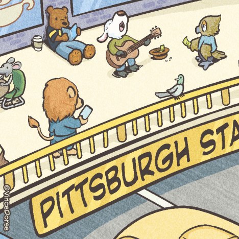
I had a lot of fun with this one. The City Paper’s editor, Lisa, wanted an illustration for a cover story on Pittsburgh’s Busways. And she wanted it to evoke that kidlit feel of something like a Richard Scarry book (with anthropomorphized animals going about their daily business).

Insta_Busway_CoverText

I also thought about those hidden picture puzzles in Highlights while I was setting up the composition. Just a lot of little things, all going on at once. I used Clip Studio Paint for this illustration. Here’s my process.

Pencils

CityPaper_Busway_VinceDorse_process

This was all sketched loosely in Clip Studio using the Blue Real Pencil. I just wanted to get something down quick to get approval from Lisa. Once she and the writer hammered out a few details, I was given the go-ahead.

Inks

CityPaper_Busway_VinceDorse_process

Inked in Clip Studio, with various inking tools. The most important tool at this stage were the Curve Rulers. I used those to ink all of those long, sweeping, curved lines (on the guardrail, sidewalks, roads, etc) and to help keep the lines of the buses and windows smooth.

Colors

CityPaper_Busway_VinceDorse_process

I used a couple layers in Clip Studio to keep the flat colors and the highlights/shadows separate. I do this mostly so if I change my mind about one or the other, I can make tiny changes without having to redo the whole thing.

Details

CP_Busway_VinceDorse

The tortoise here is being trailed by a hare (running up the stairs) that just can’t catch him. As usual, the tortoise wins this race.

CP_Busway_VinceDorse

March just wrapped up, so I had lions and lambs on my mind. I also threw in a bear with a Steelers jersey. Gotta rep the local sports teams.

CP_Busway_VinceDorse

In this section, the Pirates and Penguins get a nod. So does Pittsburgh legend Mister Rogers. His X The Owl character is going about his day wearing a classic Mister Rogers sweater.

CP_Busway_VinceDorse

The City Paper was kind enough to throw me this gig, so I made sure to put a CP Newspaper box in the picture. It was also a convenient place to put that banana the monkey’s so interested in. Oh, and that chicken? Originally, he was ‘crossing the road’ but that’s one of those edits they made at the paper. No crosswalks on busways. So now chicken’s riding the bus. I guess there’s more than one way to cross a road.

CP_Busway_VinceDorse

Ducks feeding ducks, a teddy bear at a picnic, just another pleasant day in the park. And is that a familiar friend in the bottom right?

CP_Busway_VinceDorse

Yup. I snuck in alternate universe versions of my Bigfoot and Scout characters (and even their squirrel pal, Squeaky). It’s a friendly city. I’m sure Bigfoot would feel right at home here.

And if you’d like to read the City Paper piece about Pittsburgh Busways (by Ryan Deto), here’s a handy link to the online article. -v

Do The Work: Stop swiping other people’s art.

Quick note to aspiring artists and designers. Don’t swipe. Yeah, it’s easy and maybe you can turn a buck or two passing off someone else’s work as your own. But you’re doing a disservice to those people who work hard to put out entertaining content and, maybe more importantly, you’re strangling your own creative flow. Plus it makes you look bad.

HatboxGhost_standing

This is far down on my list of things to expend energy on, but back in 2014, I did an ink sketch of the Hatbox Ghost from Disney’s Haunted Mansion. The character’s a favorite of mine, and I wanted to see what he’d look like if I put my personal spin on him. He came out okay, so I posted my process on this site and people seemed to enjoy it.

Since then, I’ve seen this exact design/image presented (without attribution to me) as someone’s cool tattoo, enlarged as someone’s Halloween lawn display, and most recently as a series of poorly-traced prints in someone’s Etsy shop. All presented as those folks’ “original design.”

RippedOffHatty3

Son, just…don’t.

If you really want to make fan art, if you really want to be creative, put some effort into it and make your own. Maybe you can’t draw as well as someone else yet, or maybe you’re creatively blocked at this moment. But honestly, the more you work on it, the more of yourself you put in your work, the more you practice…the better you’ll get.

This fan art thing? It’s just fun for me. I’m hoping not to waste too much time worrying about this stuff. I haven’t built a cottage industry on Etsy or Ebay drawing other people’s characters, but I know that some folks have and that’s maybe as far as they want to go with their art. And that’s cool. As long as it’s their art.

So, tl/dr: do the work. If you didn’t, don’t say that you did. -v

Covering A Health Issue (Ha! Pun!)

HealthIssueProcess_VinceDorse_01Here’s my latest cover for the Pittsburgh City Paper. They’re publishing their 2017 Health Issue this week, so Lisa the Art Director had me draw a kindly old doctor for the cover.

The Brief

Lisa gave me a few options to play with for the cover assignment, but they all centered around a doctor making a house call, so I tossed out a couple quick sketches. I toyed with the idea of having a young woman doctor with a modern feel, but the concept of making house calls is so quaint and outdated, I decided an old-timey doctor would fit better. The illustration was done in Clip Studio Paint, including these sketches.

HealthIssue2017Lisa liked the one on the doorstep, so we went with it. I only had a couple days, so the quicker we nail down an idea the better.

Side Note: One of the reasons it’s so fun to work with Lisa is that she has fun doing her job. She told me she kept flipping back and forth between my two sketches to make him dance. So I made a gif for her to enjoy. In fact, she just reminded me that I didn’t include it in this post, so I’m adding it just for her. : )

dancingdoc_dorse

Line

HealthIssueProcess_VinceDorse_03When I do work for the City Paper, I often use a style that tries to evoke retro comic book inks and colors. But, for this doctor piece, I wanted something a little softer, a little more storybook. So I decided I’d use one of the Clip Studio pencil tools for the linework.

Flats

HealthIssueProcess_VinceDorse_02aEven though I’m trying to avoid a comic book look, I did begin the coloring process with the standard comic book practice of laying down the flat colors. I used a standard, smooth, round brush for this.

Background

I started with the background first knowing it’d be relatively simple. The clouds in the sky were done with a low-opacity watercolor brush. The houses and trees in the distance were just blocked in with a chalk brush (you can see the rough edges), then blended into a soft blue.

HealthIssueProcess_VinceDorse_04I used that same chalk brush for most of the rest of the illustration, including the work on this picket fence and grass. The sweeping crossbeam on that fence was drawn with the assistance of Clip Studio’s curve ruler. It’s an indispensable tool I use with almost any image that has long, smooth curves.

Sunbeams

I had this idea about kitschy lighting in the background: sunbeams radiating out and upward like vintage product packaging for butter or oranges or some other wholesome food.HealthIssueProcess_VinceDorse_05I flipped the sunbeam layer on and off a few dozen times before finally deciding to keep it. I think it helps give the illustration more of an old-fashioned feel.

Modeling The Figure

The really fun part was adding all the highlights and shadows with the chalk brush. I made this animated gif to show the progression from flat color to fully-rendered.HealthIssueProcess_VinceDorse_06Here’s another reason doing the background first is helpful. The color of the highlights were pulled directly from the sunlight behind him. Same thing with the shadows. This way the figure looks like he belongs in the scene. The rosy reds on his cheeks and nose don’t really exist in the background, but they’re there to give him that friendly, cherubic glow.

Text

HealthIssueProcess_VinceDorse_07I hand-lettered the words on this cover (based on existing typefaces) because I didn’t want them to look too perfect, but I needed them to be clean and readable at a distance. For “Health Issue” I added a slightly offset drop-shadow to really give it some oomph.

Grass and Shrubs

I ran a really rough chalk brush over the lawn a few dozen times to give it a little more texture. The bushes were done with a watercolor bristle brush because I wanted the slightly ovoid stroke of a brush for the leaves, rather than the blunt mark of a chalk tool.HealthIssueProcess_VinceDorse_08I handed the piece in and then realized I’d forgotten to draw the bottom beam on the picket fence. So I fixed it and re-sent the final-final illustration to Lisa. This is why I usually sit with an illustration for a full day before handing it in — so I can catch some of my mistakes before the client does.

Finished Cover

CP_WithMasthead

And here’s the finished cover with the masthead added by the City Paper. If you’re interested in the state of health care and how it effects Pittsburghers, feel free to zip over and read the digital version online. -v

More Politics For The Pittsburgh City Paper

Today the Pittsburgh City Paper puts out their 2017 Election Guide, featuring the Mayoral Race between incumbent Bill Peduto, and challengers Darlene Harris and John Welch.

CPElection_01_Dorse

And, once again, I’ve been chosen to do caricatures of local politicians for the cover. Oh, politics. At least you afford me the opportunity to draw an elephant once in a while.

But the assignment was for more than just the cover image. This time I also had an interior spot illustration of Mayor Peduto, all gussied up as a circus ringmaster. Here’s some behind-the-scenes steps to getting this illustration from concept to print.

Peduto_caricature

Normally, doing political caricatures makes my stomach feel like I swallowed a bowl of thumbtacks for lunch. Too much pressure, too many politics. But Peduto is kind of fun to draw, so I didn’t bang my head on the desk too much during this job. First thing’s first: I collected my reference and worked up a sketch.

Peduto_caricature_Dorse

Peduto’s a little cartoony to begin with, so it’s not that far a leap from photo to caricature.

Peduto_caricature

The original brief called for the mayor to be balancing on a rubber ball, like a trained seal. But (CP Art Director) Lisa and I batted it back and forth and decided on one of those pedestals that lions perch on — maybe because he’s cast as ringmaster rather than performer, maybe because it creates the illusion of more stability, maybe it just looks better.

So, the finished sketch gets approved and I move on to inks.

Peduto_caricature

Digital inks, done in ClipStudio (Manga Studio) with a standard brush.

We also had a brief discussion about color. Traditionally, circuses use the primary colors (red, blue, yellow) and I went with that. But Lisa thought, since it was an election guide, we should go with the good ol’ red, white, and blue. I agreed.

CPElection_06_Dorse

Once the base colors are in, I start layering in the highlights, shadows, and texture. Here’s a gif that takes you from sketch to finished rendering.

CPElection_07_DorseEven though I’ve done quite a few of these political pieces for the City Paper, these caricatures are always a learning process for me. Sometimes I think I nail the likeness pretty well, sometimes I’m off the mark. But I never set out to mock anyone with the illustration. I just try to highlight predominant features or exaggerate attitude or bearing. Hopefully, it’s all taken in the spirit with which it was doodled. Good, clean fun. -v

Here’s the digital online version of this week’s City Paper, in case you’d like to read it.

Playing Politics: Process for my latest editorial assignment

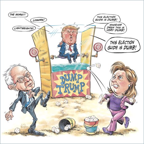
Here’s the thing about editorial illustrations during this particular election cycle: no matter which direction the job leans, left or right, you risk upsetting somebody. Depending on how you choose to look at it, this cover could go either way. I suppose that means I run the risk of upsetting everybody.DunkTank_CityPaper_VinceDorseStill, when Lisa, art director at the Pittsburgh City Paper, offered me this assignment, I took the job despite not being very political. Not because I enjoy upsetting people, but because Lisa’s great to work with and this cover seemed like a fun challenge.

ornament02

It was a simple brief: Sanders and Clinton hurling baseballs at Trump in an old-fashioned carnival dunk tank, while he hurls insults at them. The concept was simple, but I was running into a roadblock. Sanders and Clinton are both right-handed (I researched it to make sure) so I was having trouble getting the angles right while still showing their faces. Nobody pays for a caricature of the back of someone’s head.DunkTank_CityPaper_VinceDorseI suggested a slightly different Whack-A-Mole concept to avoid the issue and Lisa basically said, Vince, stop goofing off and make the dunk tank work! See? I was already upsetting someone! She sent back an altered version of my rough with Hillary rotated to make her point. She was right. I could make this work if I really tried.

ornament02

Lemme tell you something else about editorial illustrations that should be fairly obvious: You’re often called upon to do caricatures of notable people. Thing of it is…I’m not a caricature artist. It’s not my main gig (though, come to think of it, I’ve done nine or ten caricatures for the City Paper and they’re still coming back for more…so maybe I’m doing something right).caricature_heads_dorseI posted these sketches in a public forum where a few cartoonist friends hang out and got a lot of positive responses. Even Mad Magazine caricature illustrator, Tom Richmond, chimed in to offer his two cents. I took in everyone’s feedback, made some adjustments, got close enough for horseshoes, and moved on to the next stage.

DunkTank_CityPaper_VinceDorse

Here’s my finished pencils with the inks started. I used the Layer Color option to turn my pencils into a blue-line sketch, then inked on the layer above with a standard brush.

ornament02

This is a series of close-ups of Bernie from pencils to inks to flats to final colors. All of it done in MangaStudio (or ClipStudioPaint, depending on what you’re used to calling it).

DunkTank_CityPaper_VinceDorse

Pencils. Done on paper and scanned in.

DunkTank_CityPaper_VinceDorse

Inks. I think this was the G-Pen brush.

DunkTank_CityPaper_VinceDorse

Flats. These are just there to help separate the colors, no finesse needed. I think I put them in with a no-frills, flat, round inking brush.

DunkTank_CityPaper_VinceDorse

Final colors. Most of this was done with a chalk brush, or pastel. I like the textured feel of it. Maybe some airbrush for soft highlights too.

DunkTank_CityPaper_VinceDorseThese insults in the word balloons?  That’s an idea I brought to the table. I thought it’d be fun to have Trump bellowing some typical zingers (and to zing myself in the process). The art director ran it by the editor and I got the green light…they even wanted him to zing their election guide!  Assignments are more fun when you get to bounce ideas back and forth with the client.

ornament02

untitledSo here is the final CityPaper cover. I was surprised to see my “insult balloons” were the only text on the cover! And there was a bonus! We had a little extra lead time, so Lisa asked if I’d like to do an interior spot illustration of a wet, angry Trump who just got dumped in the drink. In for a penny, in for a pound, I guess…

DunkTank_CityPaper_VinceDorseI ran a few different poses by Lisa, (this trio of sketches makes it look like he’s doing a little dance) any of which she said she’d be fine with. I ended up going with one that was less “Hulk Smash!” and more “angry tantrum” because it fit the tone of the assignment better. DunkTank_DampTrumpSpot_CityPaper_VinceDorseI’ll end with this final, damp Trump (inks and full color). This editorial assignment was probably one of my favorites I’ve drawn for the City Paper despite the subject matter being a bit out of my comfort zone. I just found out Donald Trump’s gonna be in town today, the day this City Paper cover comes out. I sure hope this doesn’t upset him. -v

Tiger’s Tale: Process steps for an editorial illustration with a storybook feel.

I got an editorial assignment this week, and the subject of the piece lent itself to a storybook approach. So, instead of my editorial style, I decided to use my softer, “kid lit” style. Here’s a quick step-by-step showing how I put it together.

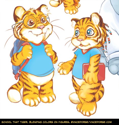
SchoolThatTiger_process_VinceDorseLong story short, they’re closing down Wilkinsburg High (mascot:tiger) and now those kids’ll be taking classes at Westinghouse High (mascot:bulldog). The art direction was to draw a bunch of super-cute baby tigers attending school at a bulldog’s doghouse. A perfect opportunity to use a kids’ art style, right? So, first things first, the pencils…

SchoolThatTiger_process_VinceDorseThis is the pencil sketch, roughed out on printer paper. I didn’t take the time to work out all the details of the building, figuring that’d take long enough in the computer and why do it twice? I worked the tigers a little more, though, because I needed to know if Lisa (the art director) thought they were cute enough to fit the brief. They were. : ) I got approval, so I moved forward.

SchoolThatTiger_process_VinceDorseI did these in MangaStudio with a pencil tool, tracing over the scanned sketch. Since Westinghouse High is the home of the bulldogs, the school was supposed to look like a doghouse. I decided to combine the classic, backyard doghouse with an old-fashioned, one-room schoolhouse complete with belfry. MangaStudio‘s rulers are so versatile and easy to use that I’ve actually learned to enjoy drawing houses and other structures.

SchoolThatTiger_process_VinceDorseNext step was coloring the schoolhouse. Sticking to that storybook aesthetic, I chose a watercolor brush, fiddled with the opacity, and just started brushing color and grain into the boards. I masked out the overlap, adjusted the levels, and after the house was done, I started in on the characters…

SchoolThatTiger_process_VinceDorseI picked a few warm colors for the tigers (oranges, reds, yellows) and painted in some base flats. I didn’t have to worry about being too neat, since I planned to blend the colors in the very next step…

SchoolThatTiger_process_VinceDorseThe colors of the clothing and accessories were determined by the school colors. Wilkinsburg, red and blue. Westinghouse, blue and white. Once I had all the colors of the tigers roughed in, I blended them, stroking the colors to look like fur. Time consuming, but I like the way it turned out. I normally block in the backgrounds first, but I saved the minimal environment until the end.

SchoolThatTiger_process_VinceDorseHere’s a quick progression of the foreground/environment. I started with some earthy colors, scribbling in some texture with a watercolor brush, adding more texture with an overlay, and deepening the shadows. Then, a rough-edged brush to map out patches of grass, followed by scattering blades of grass over the whole thing.

After that it’s just a matter of color adjustments, playing with the levels and it’s done. This was a great chance to add to my children’s illustration portfolio and still turn in an editorial assignment. The finished piece is down below, and, to see it in context, check out this week’s Pittsburgh City Paper. That link to the online edition also gives you a look at how Lisa scattered my tiger students throughout the issue and article (pp. 5,6,8&9).

SchoolThatTiger_CP_VinceDorse

My first official Peduto for the Pittsburgh City Paper

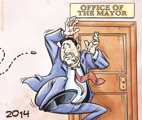
Mayor Peduto Gun Bill editorial illustrationHuzzah! Even before Bill Peduto became Mayor of Pittsburgh I’d been hoping to land an editorial assignment where I got to draw him. It finally happened this week and I actually got to draw two Pedutos! There’s absolutely zero politics behind my elation — he’s just fun to draw.  The illustration accompanies a Pittsburgh City Paper article by Rebecca Nuttail, if you’d like to see what it’s all about. Lisa Cunningham art directed this and I had a blast drawing it.

Here’s the final color version of the piece as well as the uncolored inks and a close-up detail. Inks done in MangaStudio 5, colors done in MS5 and Photoshop (still experimenting). Whether this guy ends up being a great mayor or not, I hope this is the first of many Pedutos for me. -v

Bill Peduto Gun Bill editorial illustration b/wPeduto close up detail