You Know The Name of King Kong

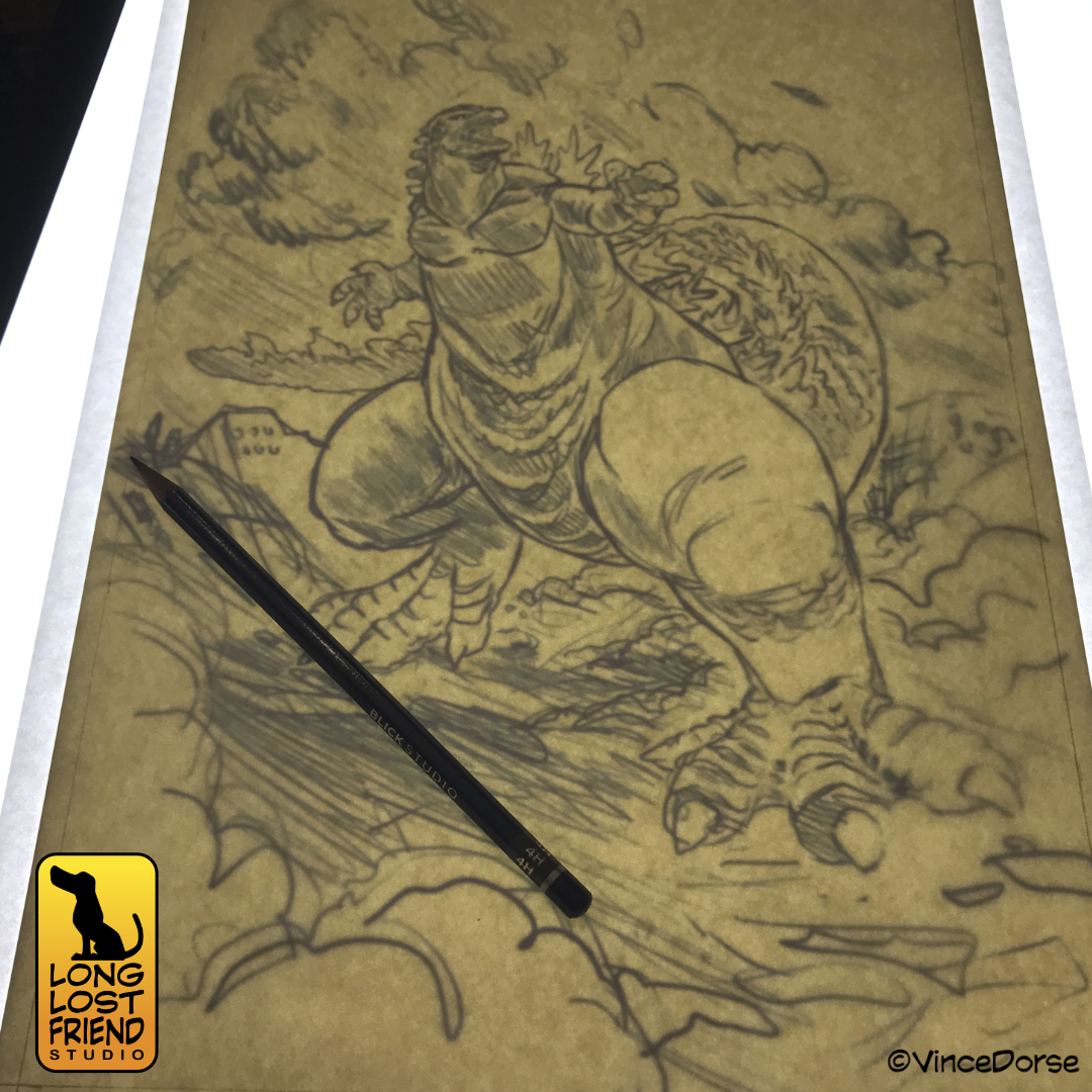
Back in January, we inked Godzilla as a way to celebrate our love of Godzilla Minus One. This month, Godzilla X Kong:The New Empire hits theatres. And while we’re not sure whether we’ll love it or not, Michelle and I thought it was only fair to ink up a King Kong in anticipation of the release.

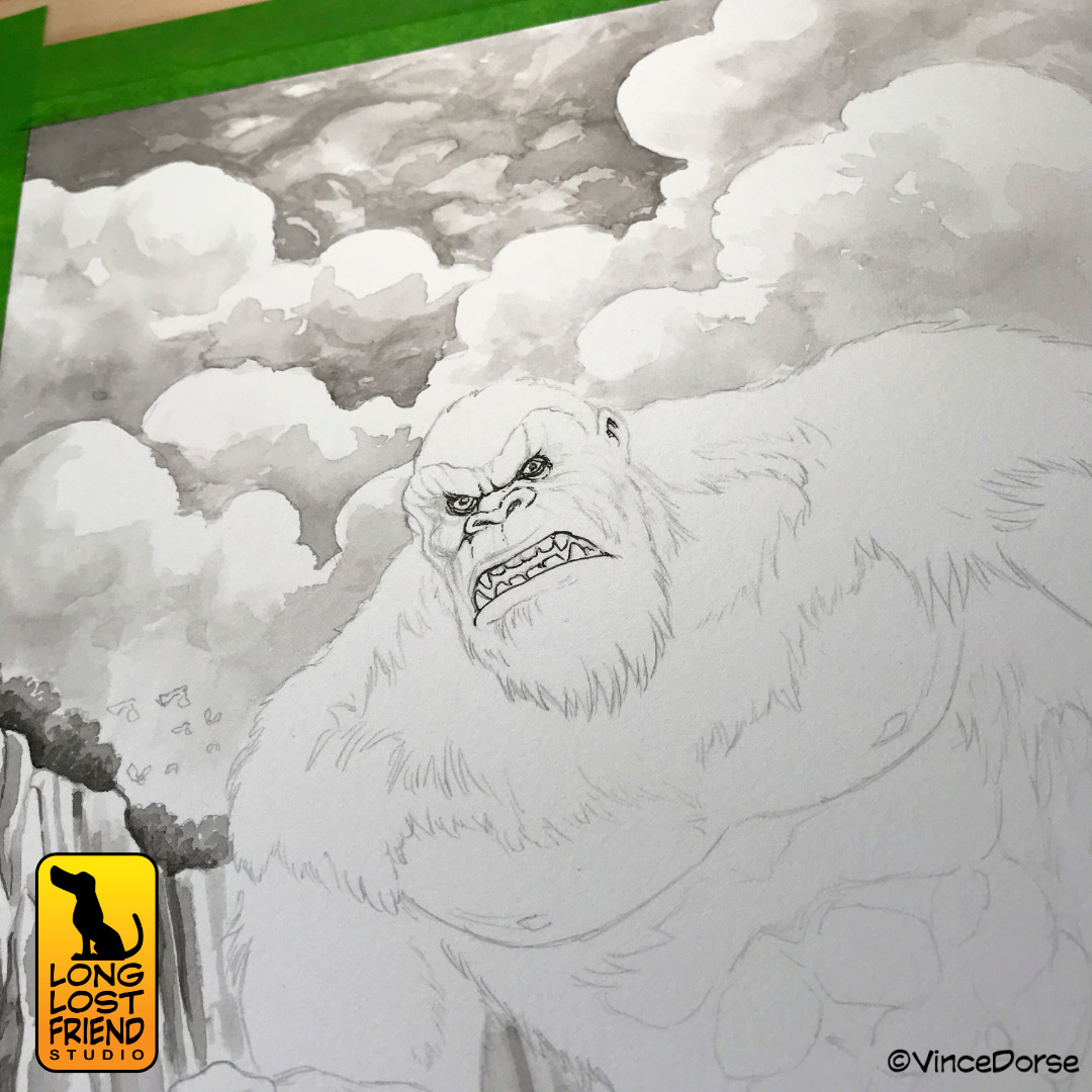
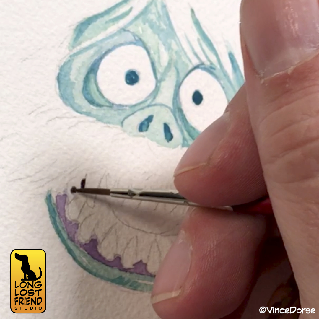
The difference between the two should be obvious. I inked Godzilla with pens, using hatching to achieve my grey tones. With Kong, I decided to use ink wash. It’s a softer look, but I think it works well for the composition and subject (a giant gorilla stomping through a misty forest on an uncharted island).

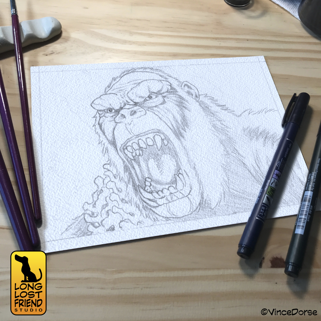
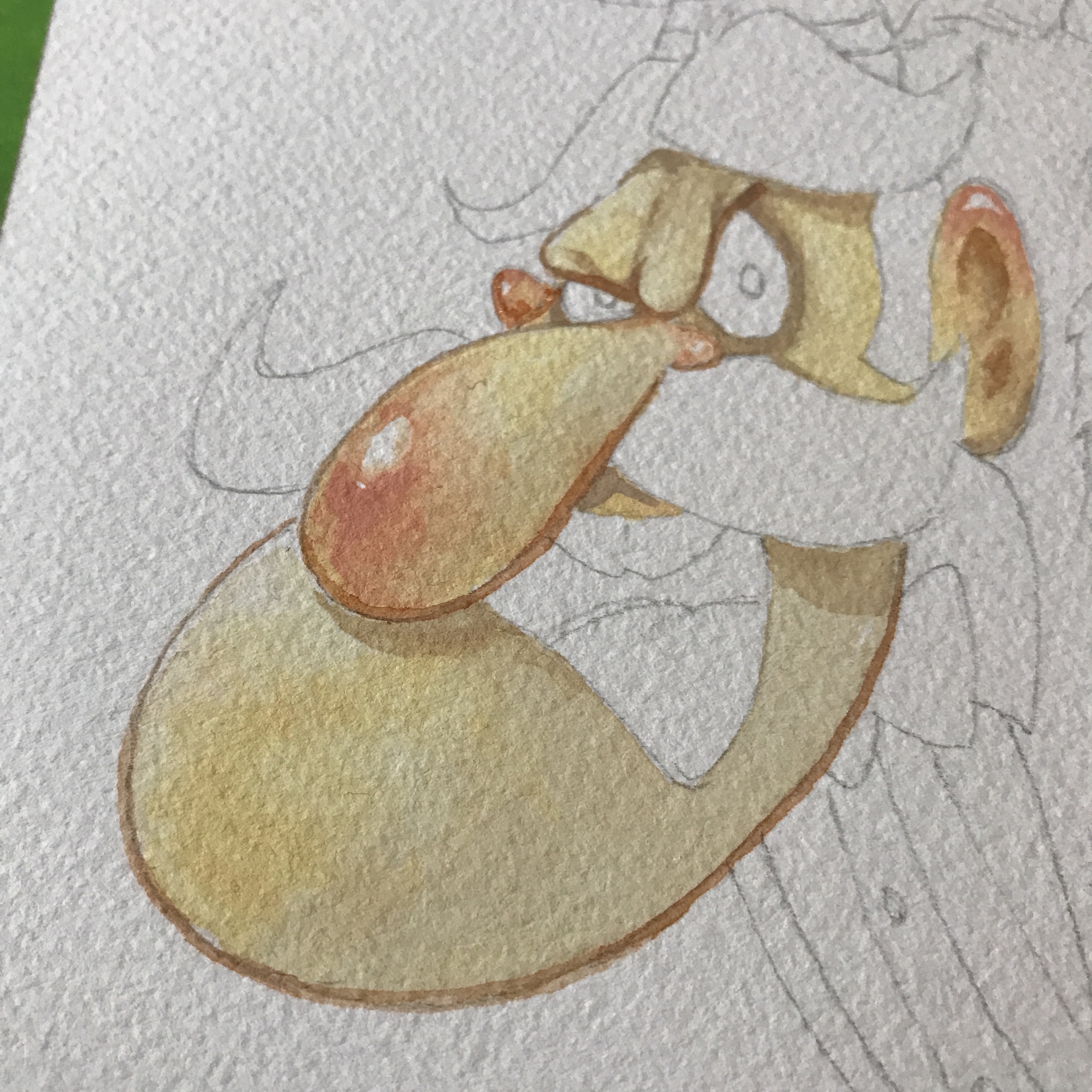
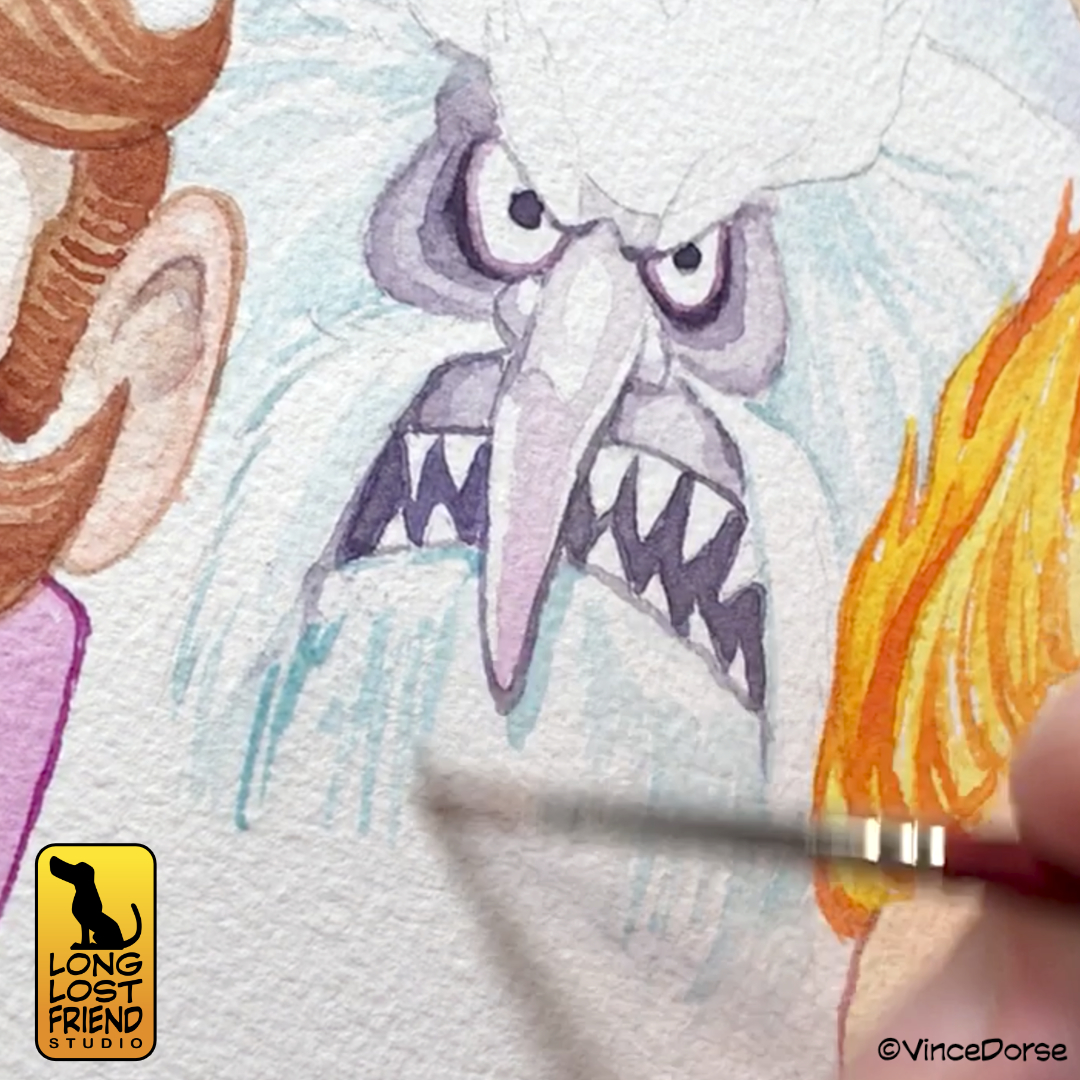
In addition to my own ape inks, we have once again conned Michelle into playing a game of “Ink It or Stink It” where she’ll take a run at inking my drawing of Kong’s apparent nemesis, Skar King.

We both learned a little about technique and materials while working on these, which is our constant goal. But if you want to see how they turned out, you can check out the video at the link below:

Inking Godzilla Minus One

I don’t know what you guys did over holiday break, but Michelle and I just kept going back to the theatre to see Godzilla Minus One. We weren’t even necessarily huge Godzilla fans before this movie. I mean, of course he’s a ton of fun. He’s a monster. But this movie? It stomped us flat and left us breathless. Best movie we’ve seen in a long time.

When I was a kid, when I saw a monster movie that got under my skin, I’d spend days lying on the living room rug filling my sketch pad (and any other random piece of paper I could lay my hands on) with drawings of the monster. So it seemed natural for me to do the same thing with this new, powerful, terrifying Godzilla.

Big difference is that now I have better tools at my disposal. So I lightboxed my sketch onto heavy cotton watercolor paper, and went at it with Black Star inks and Micron fineliners.

My plan was to set up three distinct values — lights, mids, darks — and set up the composition so that they frame each other nicely, and lead the viewer’s eye where I want it to go. I wrestled over whether to render this in inkwash or hatching — each have their benefits — but chose to go with a very measured, hatched linework for the midtones to contrast with the chaos of the subject matter.

I had a lot of fun working on this and practicing my brushwork, hatching, and monster doodling. If you want to see me put the whole things together, Michelle and I recorded my process for this week’s video and talked about our Godzilla Minus One experience (no spoilers).

Our Holiday Tribute to Rankin/Bass

If you’re old enough to have watched all those great Rankin/Bass stop motion holiday specials when you were a kid — or young enough that your parents force you to watch them because “that’s what Christmas was like when I was your age!” — then you might enjoy our holiday card for this year. It’s an illustration of some of the worst creeps and goons Rankin/Bass ever animated.

Creeps like Professor Hinkle, for example. The failed magician who ended up stalking a small child through a frozen wasteland only to lock her in a greenhouse while her magical snowman friend melted into lukewarm water. Nice guy, right? And a wonderful thing for children to watch. It really helped prepare us for the real world. Never trust a magician.

And, of course, you have the Miser Brothers, Snow and Heat. These two petulant monsters argued constantly to get their way and threw tantrums when they didn’t. A great example of now NOT to solve conflicts. These Rankin/Bass specials really were valuable on so many levels.

And that’s why we decided to honor those fantastic holiday specials with a collage of their villains. We did it in watercolor — no colored pencils or inks for linework or details — and tried to capture that holiday magic that Rankin/Bass imbued all of their stop motion specials with. Well…maybe not Little Drummer Boy. That one always put me to sleep.

If you’d like to see us put this holiday illustration together, you can watch the video below. And since it’s just a couple weeks until the end of the year — Happy Holidays! We hope you have a wonderful holiday and best wishes for 2024!

Trying Gouache For The First Time

I recently received a book filled with Mary Blair’s concept art for Disney and spent an hour flipping through all the amazing illustrations. It was a crash course in how to effectively use color and composition to tell a story.

The image above is from her concept artwork for The Adventures of Ichabod and Mr. Toad, a classic Disney feature and an annual watch around here near Halloween.

The book is filled with images like this, and, since Blair worked mostly in gouache and watercolor to create these images, it inspired me to try gouache for the first time. There’s a bit of a learning curve since this medium sits somewhere between acrylics and watercolors…and I consider myself a novice at both.

But, since experimenting is what we do around here, I pressed on. I started with a basic gradient blend, something Blair relied on heavily in her concept art. And while you can use gouache much like watercolor — diluting it and layering translucent washes — I tried to use it the way Mary Blair did in her illustrations: just enough water to create a loose but creamy texture that glides over the paper and remains satisfyingly opaque.

I ended up doing four separate paintings. Practice makes progress. Because Blair and her work for Disney was my inspiration, I stuck mostly to Disney ghosts. Doing a couple from the Haunted Mansion, and even my own take on the Headless Horseman.

For my first attempt with gouache, I was pretty happy with my results. But a lot of that was due to the gouache and how, even when the paint dried to a dead flat finish, the colors stayed vibrant and alive. I can’t wait to try it again and see what else I come up with.

The Haunted Mansion movie opens this weekend, so I may get out of the heat and into an air conditioned recliner to see if inspiration strikes again. And if you’d like to see my first-time gouache experiment, there’s a link to this week’s video below.

Monster Sculpt-Off Throwdown Showdown Rematch: The Cryptid Edition

Yes, I played with fire and got burned in another monster sculpt-off with Michelle. Our first time around, Kong vs Godzilla was our theme. But this year we decided to go with something a little more man-sized: Cryptids.

To make things worse for me, I decided against all reason that in this contest I would attempt my very first needle felted figure. And as a callback to my childhood, the monster I chose was The Jersey Devil.

Michelle, being from Western Pennsylvania, chose something a little closer to her neck of the woods, The Mothman of Point Pleasant, West Virginia.

You can watch both videos below and decide for yourself who won this years contest. But, as always, we had so much fun making these things that it hardly matters.

Here’s the Devil:

And here’s the Mothman:

Colored Pencil Practice with Hector from Coco

Couple of weeks ago, Michelle and I were racing to meet a deadline for a gallery piece but still needed to upload some sort of video to YouTube. That usually means I need to crank out some quick, 2D art and, hopefully, learn and grow a little during the creative process. Enter, Hector Rivera from Pixar’s Coco.

Hector is one of my favorite characters and, like I said, I needed to practice my colored pencil rendering. So I sketched Hector in pencil, and started layering in colors with my Prismacolor Premier colored pencils.

One of the things I wanted to work on is my blending. You can do it a few different ways. Layering color over color over color, of course. But once you have those color layers, maybe you’d like to smooth them out a bit. That’s where mineral spirits come in. You can brush those on and they act as a solvent, blending the colors even smoother.

You can also blend with a light-colored pencil, burnishing all the layers beneath into a smoother texture. I’m no expert. So I still have to work on this stuff. But that’s the benefit of cranking out a character sketch for a YouTube video. I get to practice and I end up with a fun piece of art.

Sharpened up the pencils for the final details — the decorations on Hector’s skull — and I’m about done. If you’d like to see me work on this from start to finish, the link to our video is down below.

Inking The Addams Family: Traditional vs Digital

If you watch my YouTube channel at all, you know I’ve been working on improving my traditional inking skills. This week I tried a little test with my favorite family of kooks, The Addams Family.

I did a sketch of the Addams clan and tried inking it traditionally — with pens, brush pens, and brushes. I thought the results weren’t too bad. Definitely better than they would’ve been had I not been practicing inking for the last year or so.

But I also wanted to pull the sketch into the computer and ink it digitally. I’m more comfortable with that process, and I figured I could compare and contrast afterward, to see what I needed to work on.

Both the traditional and digital versions are in this video. As well as some pics from a LIFE Magazine photospread featuring actors who DIDN’T get roles in the Addams Family after auditioning for them.

Sculpting The Zombie Lovers (Parts 1 & 2)

It’s nice to take a break from 2D work and just mess around with clay now and again. RunRedRun and I had some fun sculpting little zombie lovers. As a way to learn a new medium, you can’t go wrong starting with zombies. Any mistakes you make can be attributed to grave rot.

And when we were done sculpting the figures, we modified some cheap, craft-store coffins to give our zombies customized resting places.

We used Super Sculpey for just about all of this, and split the project up into two videos, both of which are below.

Inking the General Mills Monster Cereal Mascots (Franken Berry, Count Chocula, Boo Berry)

Last week we had another Halloween Leftover. The General Mills Monster Cereal Mascots!

I wanted to have a little fun with them, so I made them just slightly creepier than they appear on the cereal boxes.

We’ve done a few videos since then (subscribe to our YouTube channel to stay up to date) but here’s Franken Berry, Count Chocula, and Boo Berry getting the ink wash treatment:

The Fly: Ink and Watercolor

The Fly has always been one of my favorite horror movies since I saw it on TV as a kid. That giant fly-head freaked me out then and it still freaks me out now.

So I illustrated the monster in ink wash and watercolor, and played around a little with masking fluid too.

You can watch my process in the video below, and listen to Run Red Run and I gab about the movie.